


Table of contents
Score Report
The Score Report gives leaders a longitudinal view of how activity estimates have trended across their organisation over time. It combines a day-by-day chart with a structured breakdown of how each person's day looked, giving you a path from the overall pattern down to the individual events behind it.
Activity estimates are signals drawn from your connected tools, not performance ratings. They reflect how consistently someone engaged across those tools during their working hours. They do not measure output or quality, and a quiet day in the tools does not necessarily mean a quiet day in reality.
You can reach it from Reports in the top navigation, then select Score Report.
Score Trend Chart
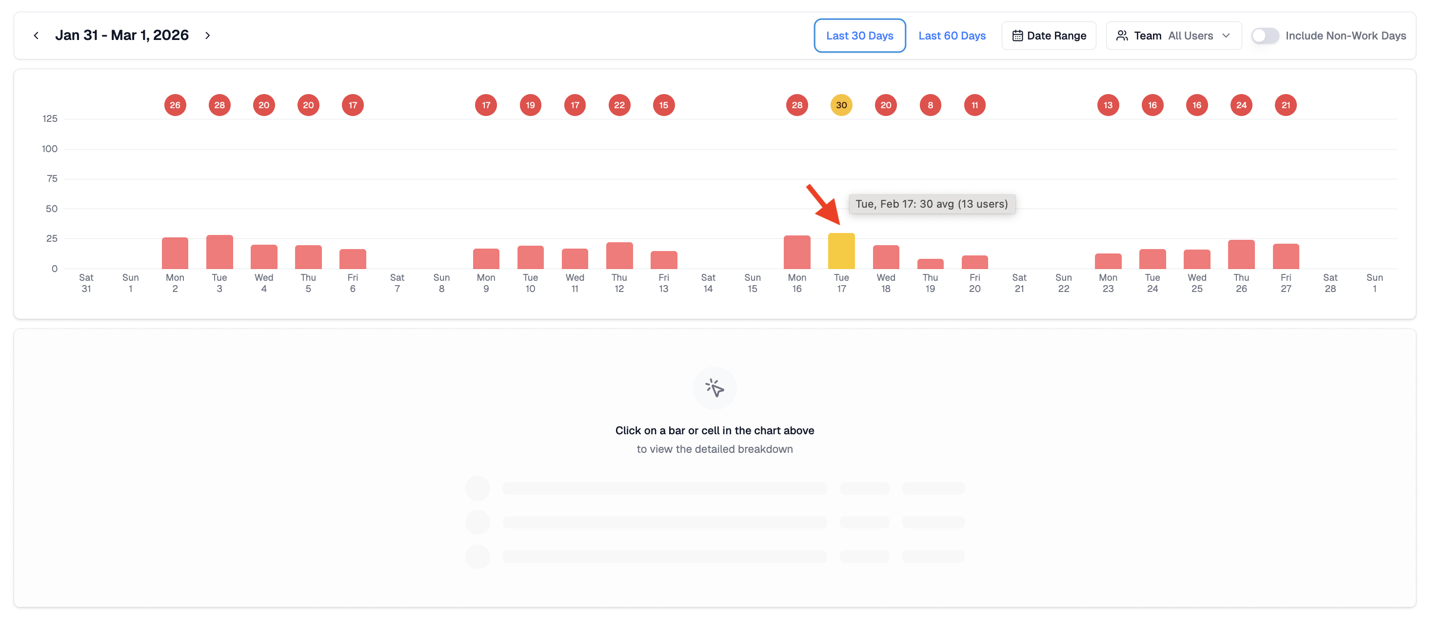
The report opens with a bar chart showing average activity estimates per day for your selected date range. Each bar represents the average across the selected users for that day.
The chart is useful for spotting periods of unusually high or low activity, stretches of consistency, or days that stand out and might be worth understanding better. A spike might reflect a deadline, a coordinated push, or simply a day when more tools were in use. A dip might reflect a quieter period, a public holiday, or a connected service that stopped sending data.
Each bar uses the same colour scale as the Activity Scores view.
- Red - very light activity, or connected services may not have sent data for this period
- Yellow - below typical activity levels but present
- Green - activity in line with a normal working day
- Blue - above typical activity levels, often reflecting extended collaboration or a busy period
- Purple - sustained high activity across the day
Daily Breakdown
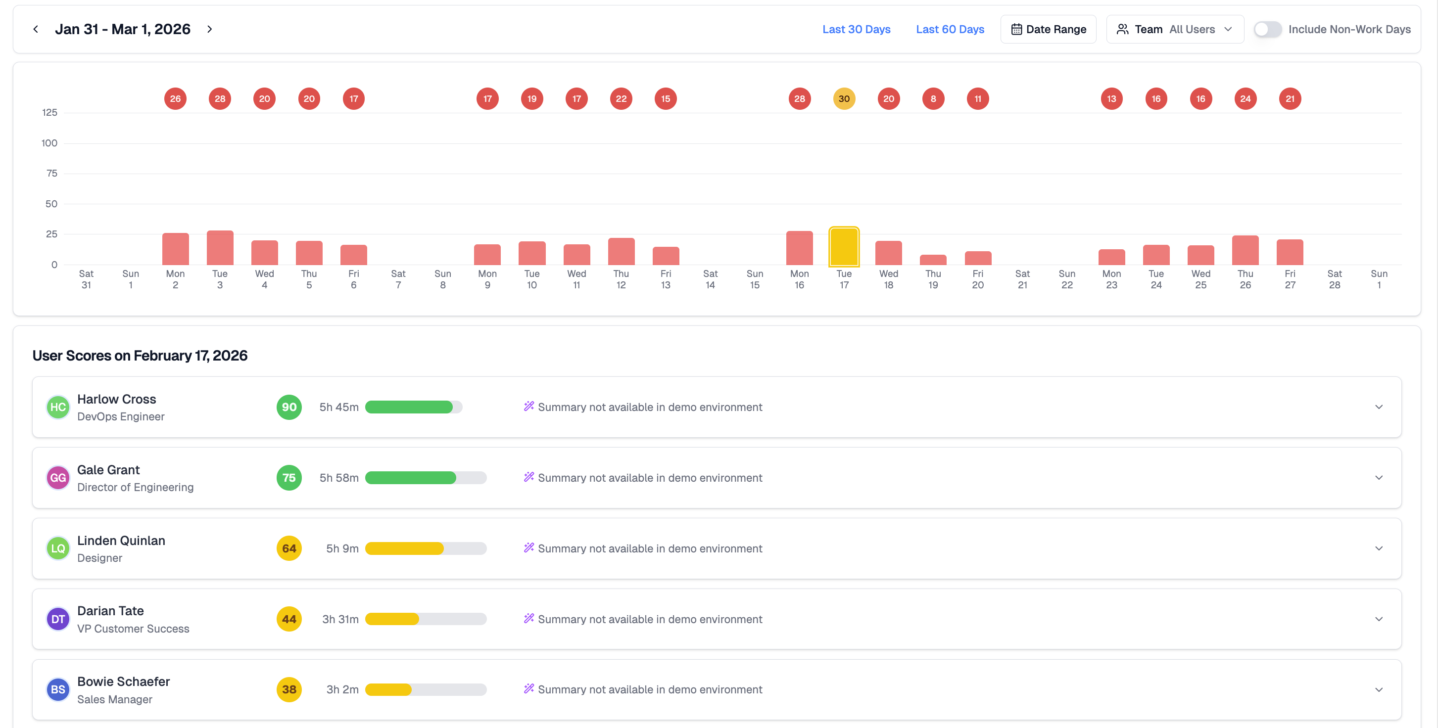
Clicking any bar opens the detailed breakdown for that day. Each row shows the person's name and role, their activity estimate for the day, total hours represented by their activity signals, a colour indicator, and an AI-generated summary of their day where available.
Because estimates are calculated relative to each person's own working hours and connected tools, they are broadly comparable across roles and team structures. That said, differences in how tools are used across functions mean estimates are best read as a relative signal rather than a precise comparison.
AI Daily Summaries
Each person's card includes an AI-generated summary describing how their day unfolded based on event timing and activity patterns. A summary might note when someone's active period started and ended, the main clusters of collaboration, or sustained work on a particular project.
Summaries do not reveal message content, file content, or personal information beyond what the activity signals themselves contain.
Viewing Options
Several controls let you adjust what the report shows.
- Date range - define the period shown in the chart. Switch between preset ranges or set a custom window.
- Team - limit the report to a specific person or group.
- Time of day - segment activity by working hours.
- Include non-work days - surface weekends or custom off-days for context.
- Sort - order the daily breakdown by estimate, name, or role.
These controls adjust the view without changing the underlying activity data.
Going Deeper
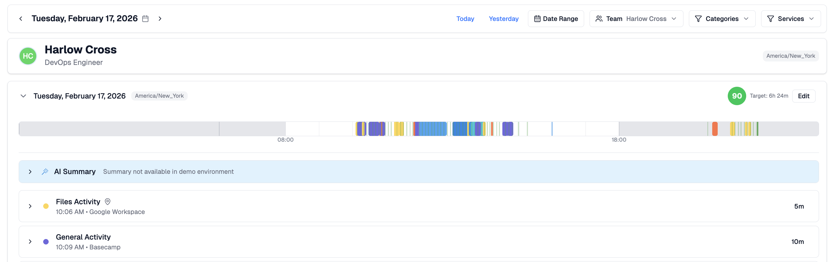
From the daily breakdown, click any person's name to open their Activity Detail view, showing a full timeline of events and categories for that day. This makes it straightforward to move from a pattern in the chart to the specific activity behind it.
Related Articles
Activity Scores - day-level activity estimates and AI summaries for your team
Activity Report - activity hours and event breakdowns across a date range
Activity Detail - full breakdown of one person's activity on a specific date